MoMA Tableau Data Visualization
Published Nov 26, 20234 min read
- tableau
- data-viz
- dashboard
An interactive data visualization project exploring the Museum of Modern Art’s extensive collection of modern and contemporary art
The MoMA Dataset
Visiting museums is one of my favorite activities, so I was motivated to work with the open data provided by the Museum of Modern Art, available here: github/MuseumofModernArt
This source contains 140,000+ records. The data provided is broken up into two files:
Artists.csvArtworks.csv
Key columns used in this analysis include:
AccessionNumber- a unique ID provided to each artwork in the collectionConstituentID- a unique ID for each artist who contributed works in the collectionTitle- Title of the artworkDisplayName- the name of the ArtistDateAcquired- Indicates the date the artwork was acquired by the Museum of Modern Art
Other fields such as Nationality, Gender, Height (cm), Width (cm), and more were also utilized.
The tables were joined on ConstituentID, which uniquely identifies artists and has a one-to-many relationship with the artworks.
Goals of the project
- Visualize how the museum’s acquisitions have changed over time
- Visualize the collection as a whole (e.g. which artists created the most art?)
- Utilize the look and feel of moma.org
Calculated fields
Using Tableau’s calculated field functionality, I was able to setup fields to make my visualizations more clear.
Primary Department
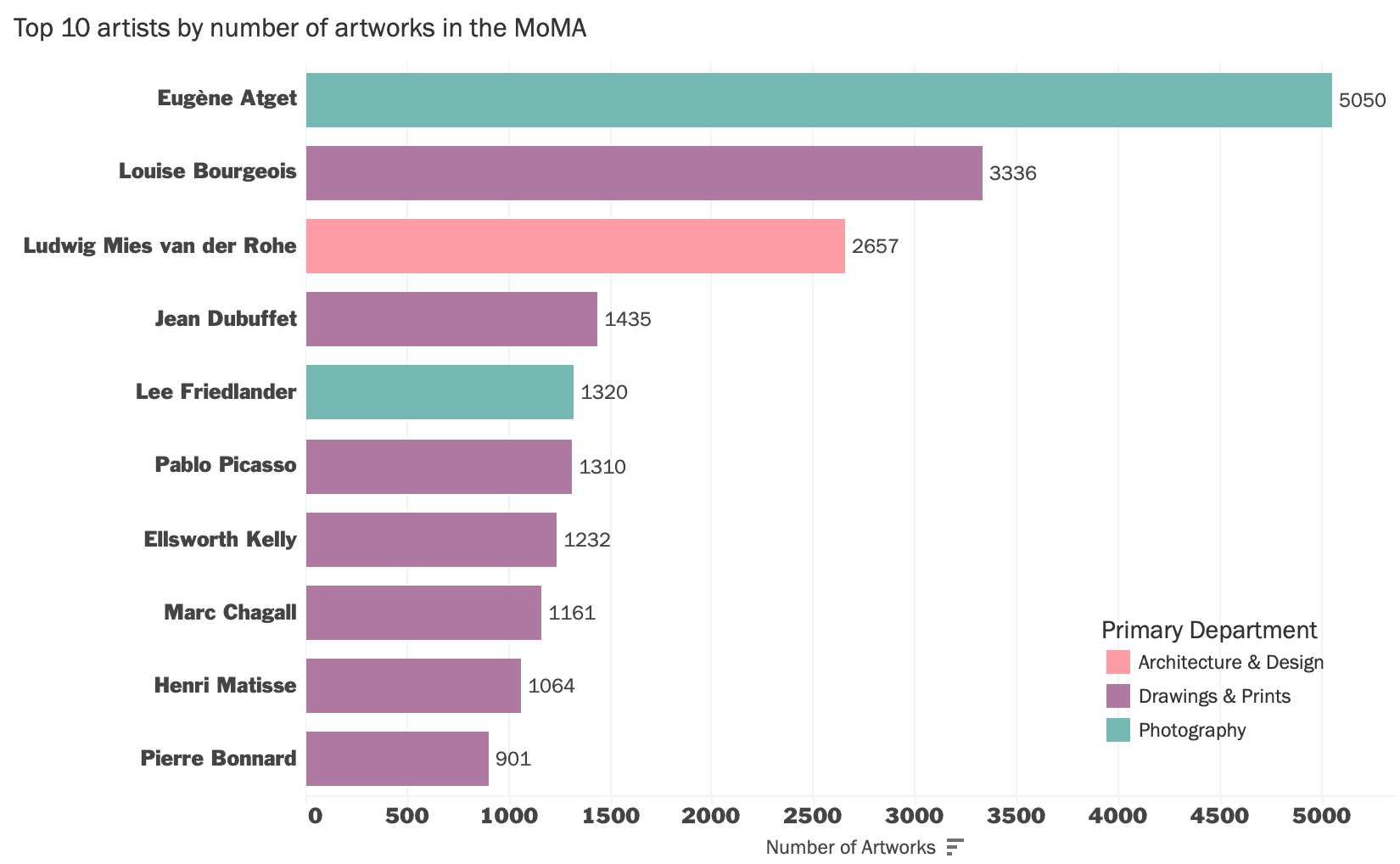
For example, on the Top 10 artists by number of artworks chart above, I wanted to use colors to idenitfy an artist’s department but ran into an issue where some artists have artworks belonging to other categories than their primary field of work. For the purpose of this dashboard, I used a calculated fields so users can see at a glance the artist’s primary department.
First, I needed to get the number of records for an artist’s largest (primary) department. The calculated field below finds the count of distinct records for each department and returns the largest (MAX) one.
MAX records:
{FIXED [Constituent ID]: MAX({FIXED [Constituent ID], [Department] : COUNTD([Accession Number])})}Then, to find their primary department, I used an IF statement to find what department matches the number of records we got from the previous calculation.
Primary Department:
{FIXED [Constituent ID]: MAX(
    IF {FIXED [Constituent ID], [Department]: COUNTD([Accession Number])} = [MAX records] THEN
        [Department]
    END
)}
The calculated field above looks at each Artist (ConstituentID) and checks to see if the count for each department equals the MAX records value.
Orientation
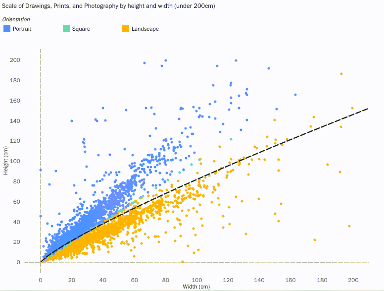
To get the orientation calculated field, I calculated the width-height ratio and determined if it was equal to, greater than, or less than one.
IF SUM([Width (cm)]) / SUM([Height (cm)]) = 1 THEN "Square"
ELSEIF SUM([Width (cm)]) / SUM([Height (cm)]) > 1 THEN "Landscape"
ELSEIF SUM([Width (cm)]) / SUM([Height (cm)]) < 1 THEN "Portrait" END
Tooltip Hover
I also utilized embedding workbooks into the tooltip. On each visualization, you can hover a point to see more information, but for some charts, it was useful to embed a workbook. For the orientation plot, I used this trick so that the user could hover any point on the scatterplot to see the title, the artwork, and the dimensions of the art.
Tooltip for the Scale Scatterplot:
<ATTR(Display Name)>
<Height (cm)> cm x <Width (cm)> cm
<Sheet name="ThumbnailHover" maxwidth="300" maxheight="300" filter="<All Fields>">
Utilizing Trend Lines & Average Lines
For the line chart representing the percentage of artworks acquired by Female artists, it was essential to use trend lines and averages.
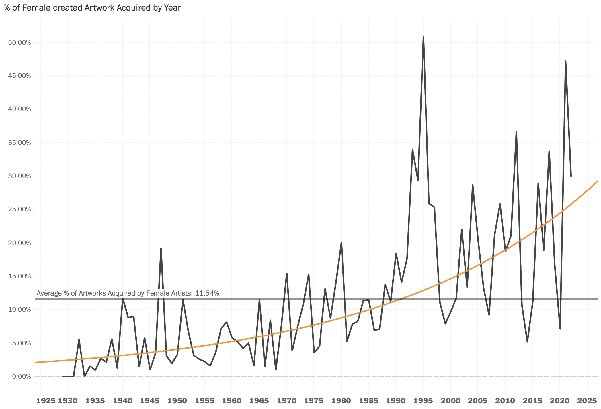
Of course we can see the MoMA has been acquiring more female-created art over time but the trend line provides clarity and it becomes clear how low the acquistion rate has been throughout the museum’s history. The trend line also highlights that the museum has been more consistent at surpassing their average of 11.54%.
Conclusion
Even just by using a few data points, we can uncover trends and patterns about the museum and visualize them in an interesting way. From their acquisition rates by gender and viewing the collection by nationality to seeing what departments the MoMA is composed of.
You can view the project in its original dimensions here: MoMA Data Visualization in Tableau