MTA Subway Ridership Analysis
Published Aug 22, 20239 min read
- python
- data-viz
- machine-learning
- eda
Exploratory Data Analysis & Machine Learning on one year of NYC subway data.
View on Kaggle

Understanding the dataset
This data set is provided by the Metropolitan Transportation Authority via the NYC Open Data platform. The ridership metrics provided may differ slightly, but are within 1% of ridership figures provided at public MTA board meetings. Data is released weekly. The latest version of the dataset can be found here .
Potential Goals of Analysis
- What is the best time to schedule maintenance?
- Which factors are most important to ridership (time of day, day of week, etc.)?
- Which borough has the most riders?
- Which station sees the most riders?
- Does subway usage have seasonal trends?
- Is there potential to build a model to predict ridership?
Overall, by answering these questions and gaining a further understanding of ridership, my research should highlight the potential for the MTA to use data to improve crowd management, service performance, and maintenance scheduling.
Data Analysis
The most necessary columns for our analysis are the following:
transit_timestamp(to identify the time of day)station_complex(to identify the station)ridership(to identify the number of people entering the station at a given time)latitude/longitude/georeference(to identify the location of the station)
1. Importing the required libraries
import pandas as pd # for data manipulation and analysis
import numpy as np

import seaborn as sns # for data visualization
import matplotlib.pyplot as plt
import plotly.express as px

import dash # for building interactive visualizations
from dash import dcc, html, Input, Output

import geopandas as gpd # for geographic data manipulation
from shapely.geometry import Point, Polygon

from sklearn.model_selection import train_test_split # for machine learning
from sklearn.ensemble import RandomForestRegressor
from sklearn.metrics import mean_absolute_error, mean_squared_error, r2_score
2. Data Preperation
Read CSV to Dataframe
# read csv file to pd dataframe
df = pd.read_csv('MTA_Subway_Hourly_Ridership__Beginning_February_2022.csv')
Preparing the data for datetime format
# change transit_timestamp to datetime object
df['transit_timestamp'] = pd.to_datetime(df['transit_timestamp'])
Make a copy before slicing the dataset
original_df = df.copy()Get data for one year
Since the data begins on February 1st 2022 we will use the data from Feb. 2022 → Feb. 2023.
# Filter data for the specified time range
start_date = pd.Timestamp('2022-02-01')
end_date = pd.Timestamp('2023-02-01')
df = df[(df.transit_timestamp >= start_date) & (df.transit_timestamp < end_date)]

# check the earliest and latest time of the data
print(df['transit_timestamp'].min())
print(df['transit_timestamp'].max())
Output:
2022-02-01 00:00:00
2023-01-31 23:00:00
Clean station names
# remove the () and everything in between the () from each station_complex row in the df
df['station_complex'] = df['station_complex'].str.replace(r'\(.*\)', '', regex=True)
Preparing the data for geovisualization
# make geodataframe out of df
gdf = gpd.GeoDataFrame(df, geometry=gpd.points_from_xy(df['longitude'], df['latitude']))

geo_stations_df = gdf.groupby(['station_complex_id', 'station_complex', 'borough', 'latitude','longitude', 'geometry'])['ridership'].sum().reset_index()
3. Exploratory Data Analysis
How many subway stations are in the dataset?
# print the number of unique station complex ids
print(df['station_complex_id'].nunique())
423
Create a new dataframe grouped by station and ridership
by_station_df = df.groupby(['station_complex_id', 'station_complex', 'borough', 'latitude', 'longitude'])['ridership'].sum().reset_index() by_station_df.shapeRidership by borough
# get the total ridership by borough
boroughs = df.groupby('borough')['ridership'].sum()
boroughs
BK 237932586
BX 81994749
M 560176396
Q 156471936
Ridership by borough treemap
fig = px.treemap(boroughs, path=[boroughs.index], values=boroughs.values, title='Subway Ridership by Borough')
fig.show()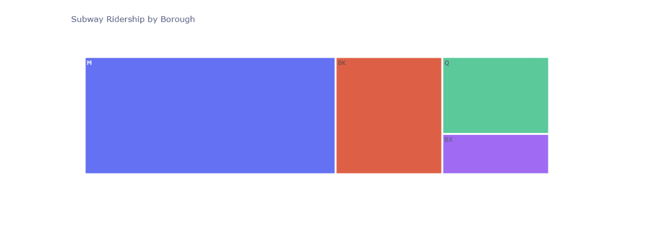
We can see that Manhattan has the most ridership, followed by Brooklyn, Queens, and the Bronx.
Number of stations by borough
station_count = by_station_df['borough'].value_counts()
borough_names = ['Brooklyn', 'Manhattan', 'Queens', 'Bronx']

fig = px.bar(x = borough_names, y = station_count.values,
       color = station_count.index, text = station_count.values,
       title = 'Number of Stations by Borough')

fig.update_layout( xaxis_title = "Boroughs", yaxis_title = "Subway Stations")
fig.show()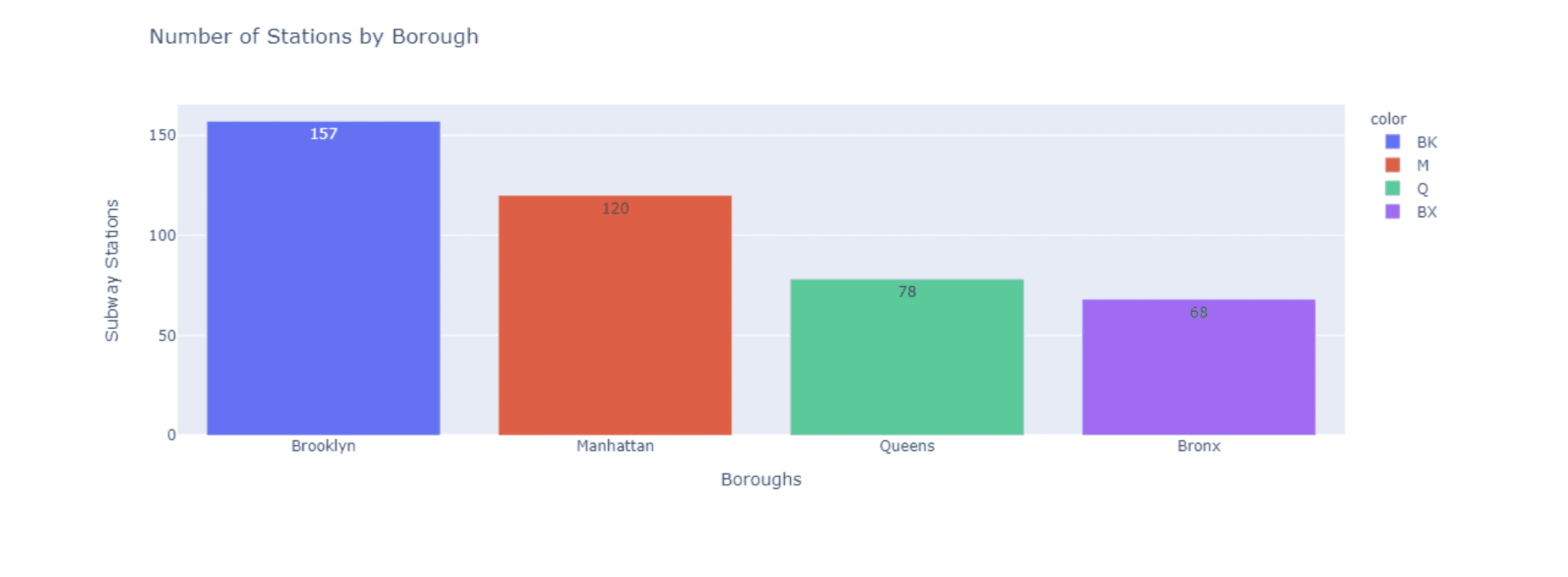
We can see that Manhattan actually has less stations than Brooklyn despite having the most ridership.
Using a strip plot it allows us to see that each borough has a high concentration of stations with a under 5 million riders. However, each borough has a few stations with a much higher ridership than the rest, we can also see just how vast the difference is between the Times Sq-42 St. station and the rest of the stations.
# make a copy of by_station_df and divide the ridership by 1 Million to normalize the data to millions
by_station_df_normalize = by_station_df.copy()
by_station_df_normalize['ridership'] = by_station_df_normalize['ridership']/1000000

sns.stripplot(x=by_station_df_normalize['ridership'], y=by_station_df_normalize['borough'], hue=by_station_df_normalize['borough'])
plt.yticks([0, 1, 2, 3], ['Manhattan', 'Brooklyn', 'Queens', 'Bronx'])
plt.xlabel('Total Ridership in Millions')
plt.ylabel('Borough')
plt.annotate('Times Sq-42 St', xy=(0.76, 0.915), xycoords='axes fraction')
plt.title('Ridership by Borough')
plt.show()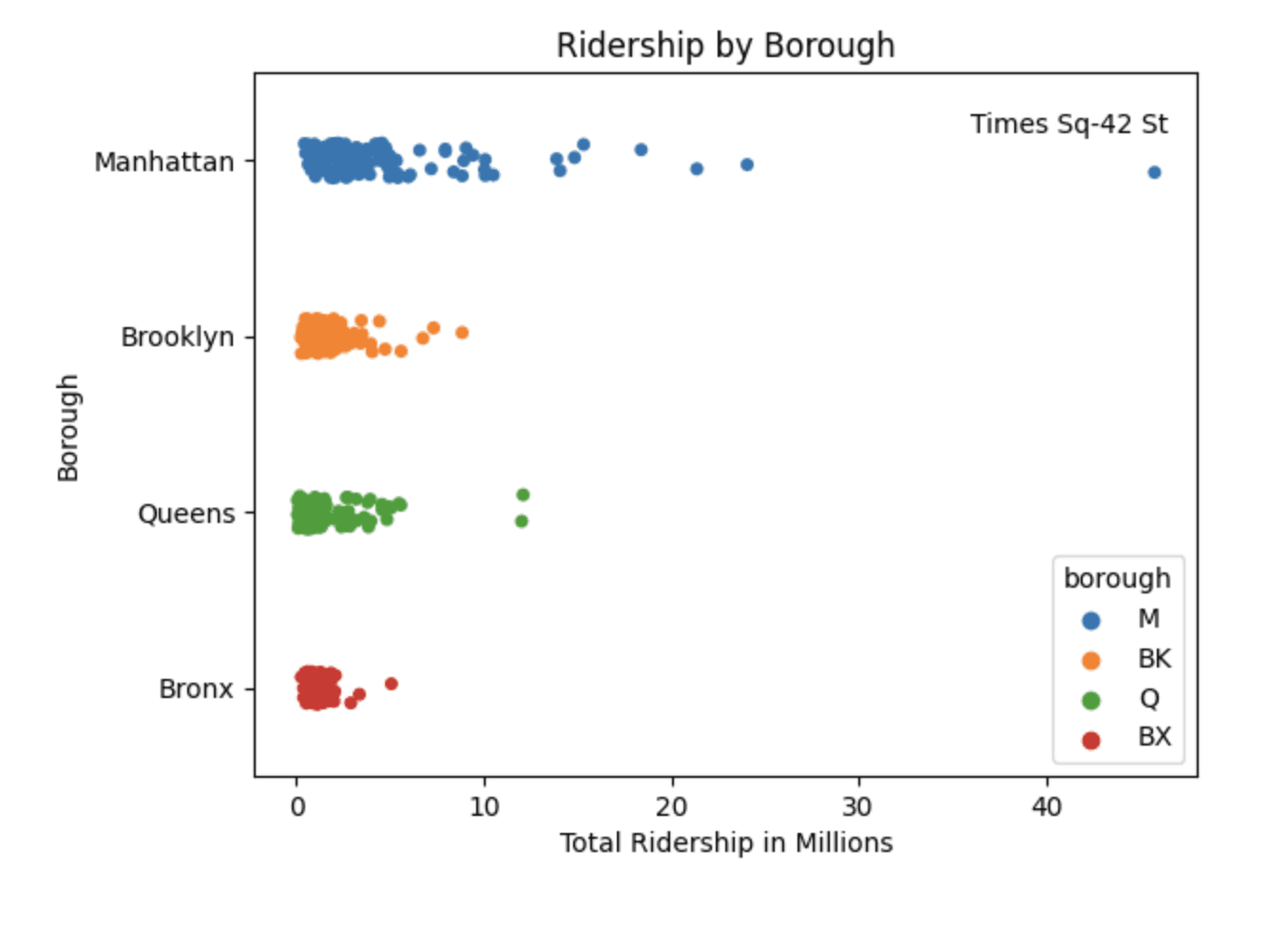
Ridership by day of the week
# make a new column called day_of_week using the transit_timestamp column
df['day_of_week'] = df['transit_timestamp'].dt.day_name()

# Extract the date part from the datetime values and assign to a new column
df.loc[:, 'date_only'] = df['transit_timestamp'].dt.date

# Get the count of unique calendar days
unique_days_count = df['date_only'].nunique()

# Display the result
print("Count of unique calendar days:", unique_days_count)
Count of unique calendar days: 365
Group dataframe by day_of_week
by_day = df.groupby(['day_of_week'])['ridership'].sum().reset_index()

by_day.shape
Reorder the dates by setting up a list of days
lst = ["Monday", "Tuesday", "Wednesday", "Thursday", "Friday", "Saturday","Sunday"]
by_day["day_of_week"] = pd.Categorical(by_day["day_of_week"], categories=lst, ordered=True)

# Sort the DataFrame based on the custom order of the 'day_of_week' column
by_day = by_day.sort_values("day_of_week")

# Reset the index if needed
by_day = by_day.reset_index(drop=True)
Average ridership per day
by_day['ridership_per_day'] = by_day['ridership'] / 365ridership_per_day plot
# plot the ridership_per_day
by_day['ridership_per_day'].plot(kind='bar')
plt.title('Number of Riders by Day of the Week')
plt.xlabel('Day of the Week')
plt.ylabel('Number of Daily Riders')
plt.xticks(rotation=45)
plt.xticks(range(7), lst, rotation=65)
plt.show()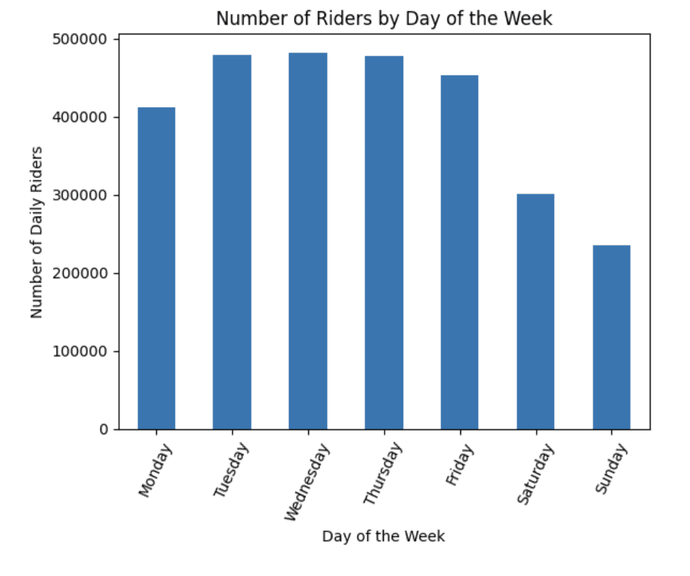
We can see that the middle of the work week tends to have the highest number of riders, with a significant decrease on the weekends. We can create a similar visualization to see the ridership by month.
Ridership by month
df.loc[:, 'month_only'] = df['transit_timestamp'].dt.month

by_month = df.groupby(['month_only'])['ridership'].sum().reset_index()
by_month['ridership_per_month'] = (by_month['ridership'] / 12).round().astype(int)

plt.bar(by_month['month_only'], by_month['ridership_per_month'])
plt.xlabel('Month')
plt.ylabel('Ridership')
plt.title('Ridership per Month')
plt.xticks(by_month['month_only'], ['Jan', 'Feb', 'Mar', 'Apr', 'May', 'Jun', 'Jul', 'Aug', 'Sep', 'Oct','Nov', 'Dec'])
plt.show()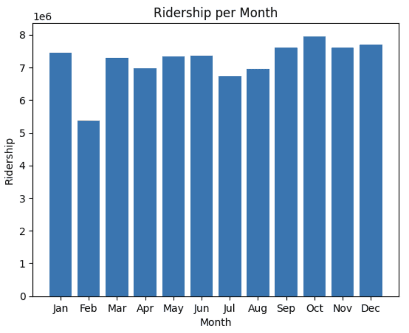
We see a significant decrease in February and a slight drop off during July and August. This is likely due to February only having 28 days and July and August being popular vacation months.
Ridership by hour
# Extract the hour from 'transit_timestamp'
df['hour'] = df['transit_timestamp'].dt.hour

# Calculate the average number of riders for each hour
average_riders_per_hour = df.groupby('hour')['ridership'].mean()

# Plot the data
plt.figure(figsize=(10, 6))
plt.plot(average_riders_per_hour.index, average_riders_per_hour.values, marker='o', linestyle='-')
plt.xlabel('Hour of the Day')
plt.ylabel('Average Number of Riders')
plt.title('Average Number of Riders per Hour')
plt.xticks(average_riders_per_hour.index)
plt.grid(True)
plt.show()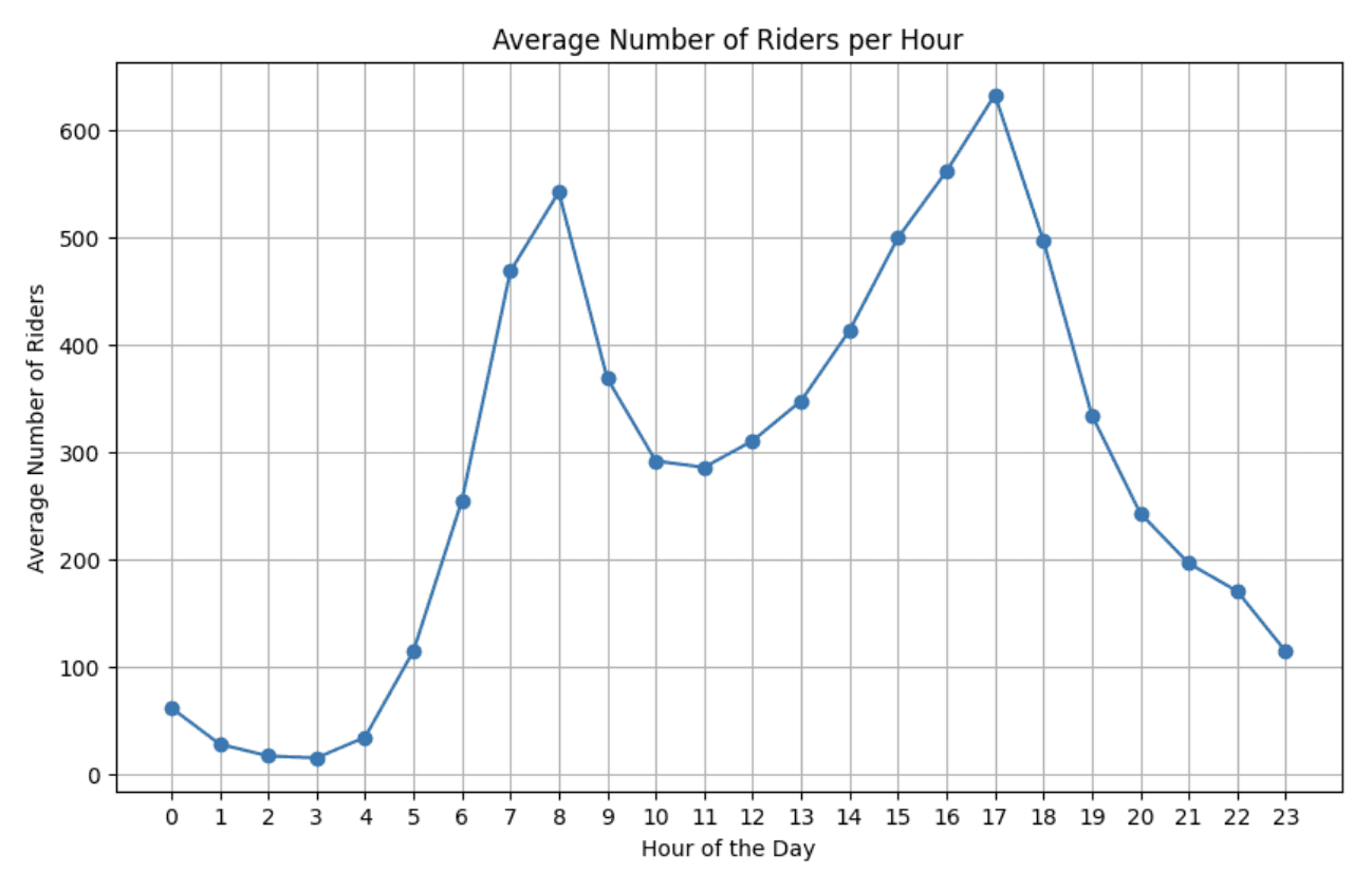
Most Popular Stations
Popularity based by average ridership
top_10_stations = by_station_df.sort_values(by=['ridership'], ascending=False).head(10)

# Borough colors
borough_colors = {'M': 'blue', 'BK': 'orange', 'Q': 'green', 'BX': 'red'}

plt.figure(figsize=(10, 5))

# Plot each bar separately with the specified color
for i, station in enumerate(top_10_stations['station_complex']):
    plt.barh(station, top_10_stations['ridership'].iloc[i], color=borough_colors[top_10_stations['borough'].iloc[i]])

plt.title('Top 10 Stations with Highest Traffic', fontsize=20)
plt.xlabel('Ridership', fontsize=15)
plt.ylabel('Station', fontsize=15)
plt.xticks(fontsize=12)
plt.yticks(fontsize=12)
plt.gca().invert_yaxis()

# Create custom legend for borough colors
handles = [plt.Rectangle((0, 0), 1, 1, color=borough_colors[borough]) for borough in borough_colors]
labels = list(borough_colors.keys())
plt.legend(handles, labels, title='Borough')

plt.show()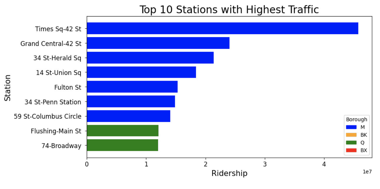
How much usage do the top 10 stations account for?
# sum of all ridership in by_station_df
total_ridership = by_station_df['ridership'].sum()
top_10_ridership = top_10_stations['ridership'].sum()

percentage_of_ridership_from_top10 = top_10_ridership / total_ridership * 100
print(f"Percentage of total ridership from the 10 most popular stations: {percentage_of_ridership_from_top10:.2f}%")

# get total number of rows in the dataframe
stations_total = len(by_station_df)
print(f"These 10 stations only account for {((10/stations_total)*100):.2f}% of the total number of stations")
Percentage of total ridership from the 10 most popular stations: 18.51%
These 10 stations only account for 2.36% of the total number of stations
4. Predicting Ridership
If we can create a model to predict ridership at any given time, this would be an incredibly useful tool for the MTA to use. This would allow them to better plan for maintenance, staffing, and other resources. This data set is limited to only a few factors that could affect ridership, but it is a good starting point and will indicate if it is possible to create a model to predict ridership.
I chose to use Random Forest Regression for this task because we needed to choose a model that can handle non-linear data and it is not prone to overfitting.
# make a new dataframe called rfr_df
rfr_df = pd.DataFrame()
Prep the new data frame
rfr_df['month'] = original_df['transit_timestamp'].dt.month
rfr_df['day'] = original_df['transit_timestamp'].dt.day
rfr_df['hour'] = original_df['transit_timestamp'].dt.hour
rfr_df['ridership'] = original_df['ridership']

rfr_df = rfr_df.groupby(['month', 'day', 'hour'])['ridership'].sum().reset_index()

rfr_df.head()
Decide key features and split data into testing and training sets
X = rfr_df[['month', 'day', 'hour']]
y = rfr_df['ridership']

# Split the data into 80% training and 20% testing
X_train, X_test, y_train, y_test = train_test_split(X, y, test_size=0.2, random_state=42)
Instantiate RFR model, train and make predictions…
# Split the data into features and labels
labels = np.array(rfr_df['ridership'])
features = rfr_df.drop('ridership', axis=1)
feature_list = list(features.columns)
features = np.array(features)

# Split the data into training and testing sets
train_features, test_features, train_labels, test_labels = train_test_split(
    features, labels, test_size=0.25, random_state=38
)

# Instantiate model with decision trees
rf = RandomForestRegressor(n_estimators=400, random_state=38)

# Train the model on training data
rf.fit(train_features, train_labels)

# Make predictions on the test set
predictions = rf.predict(test_features)

# Calculate the absolute errors
errors = abs(predictions - test_labels)

# Print out the mean absolute error (MAE)
mae = mean_absolute_error(test_labels, predictions)
print('Mean Absolute Error:', round(mae, 2), 'riders.')

# Calculate the R-squared (R2)
r2 = r2_score(test_labels, predictions)
print('R-squared (R2):', round(r2, 2))

# Calculate and display Mean Absolute Percentage Error (MAPE) and Accuracy
mape = 100 * (errors / test_labels)
accuracy = 100 - np.mean(mape)
print('Accuracy:', round(accuracy, 2), '%.')

# Create a scatter plot to visualize the predictions vs. actual values
plt.figure(figsize=(10, 6))
plt.scatter(test_labels, predictions, alpha=0.7)
plt.plot([min(test_labels), max(test_labels)], [min(test_labels), max(test_labels)], 'r--')

plt.xlabel('Actual Ridership')
plt.ylabel('Predicted Ridership')
plt.title('Random Forest Regressor: Actual vs. Predicted Ridership')
plt.show()
Mean Absolute Error: 31931.12 riders.
R-squared (R2): 0.88
Accuracy: 75.47 %.
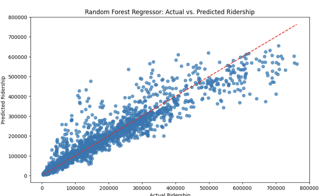
We can see we got an impressive R2 score of 0.88. These results were very promising considering it was only based on three factors. Unfortunately, the model has a mean absolute error of ~32,000. However if more factors like weather or station were added to the model, this could potentially be improved.
What are the most important features in our model?
# Train the model on training data
rf.fit(train_features, train_labels)

# Get feature importances
feature_importances = rf.feature_importances_

# Associate feature importances with feature names
feature_importance_list = list(zip(feature_list, feature_importances))

# Print the top N most important features and their importances
for feature, importance in feature_importance_list:
    print(f"{feature}: {importance}")

# Create a bar plot to visualize feature importances
plt.figure(figsize=(10, 6))
plt.bar(range(len(feature_importances)), feature_importances)
plt.xticks(range(len(feature_importances)), [feature[0] for feature in feature_importance_list], rotation='vertical')
plt.xlabel('Features')
plt.ylabel('Importance')
plt.title('Feature Importances')
plt.show()
month: 0.25222014283065824
day: 0.13287063052608278
hour: 0.6149092266432591
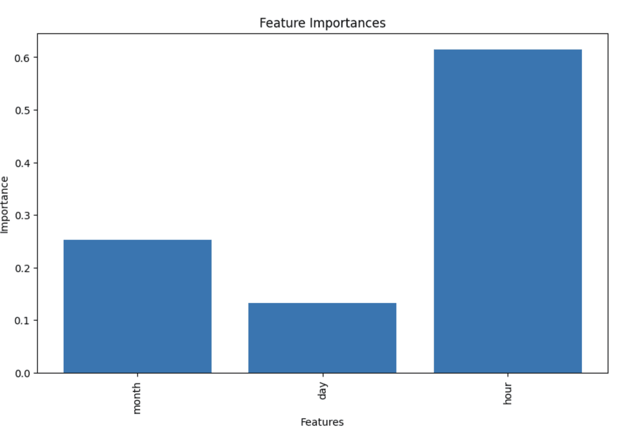
The hour of day is a major indicator on the amount of ridership.
Predicting ridership function
def predict_and_show_ridership(month, day, hour):
    input_data = np.array([[month, day, hour]])
    predicted_ridership = rf.predict(input_data)
    actual_ridership = rfr_df[(rfr_df['month'] == month) & (rfr_df['day'] == day) & (rfr_df['hour'] == hour)]['ridership'].values[0]

    print(f"Input: Month={month}, Day={day}, Hour={hour}")
    print(f"Predicted Ridership: {round(predicted_ridership[0], 2)}")
    print(f"Actual Ridership: {actual_ridership}")
Test the function
# Test the function with a specific input
predict_and_show_ridership(month=5, day=5, hour=12)
Input: Month=5, Day=5, Hour=12
Predicted Ridership: 286930.37
Actual Ridership: 299513
predict_and_show_ridership(month=3, day=27, hour=2)Input: Month=3, Day=27, Hour=2
Predicted Ridership: 15467.66
Actual Ridership: 15270
Conclusion
This analysis has successfully shown that many of the potential goals of the analysis can be answered using the available data.
Schedule maintenance and improve crowd management
This analysis shows we can easily determine the trends for which stations, time of day, and day of the week that have the most riders. This information can be used to schedule maintenance and improve crowd management. This was achieved with with bar charts, strip plots, and tree maps.
Ridership by location
It is also clear that by using geovisualization and exploratory data analysis techniques, we can see which boroughs and stations have the most riders. The heat map and dash app are great tools to visualize this data. The heat map and further information about visualizing the data can be found here .
Predicting Ridership
We were able to predict ridership with a high degree of accuracy. This shows that there is potential to build a model to predict ridership. I believe that given the right data, this model could be improved and reliably predict how many riders will be at a given station at a given time.